06 / 08
Print, Signage, Direct Mail
Advertising
Role
Lead Designer & Digital Marketer
Year
2025 to Present
Discipline
Status
Case study

The Challenge
Take the brand off the screen.
The digital brand for Rob's Roofing was locked in: logo system, type, color, tone. But most of the business still happens in driveways, mailboxes, and neighborhood streets, not browsers. Every printed touchpoint needed to read as the same company that shows up online, at every size and in every medium.
The mandate was a full print and advertising system: signage people see from the road, door hangers that get picked up instead of tossed, sales folders that close deals in the living room, and small-format pieces (stickers, business cards, email signatures) that keep the brand consistent all the way down to the smallest surface.
The System
One brand, every surface.
The same three anchors carry across every piece: the stacked Rob's mark, a deep black field with a red accent bar, and a consistent trust stack (GAF Master Elite, Polyglass, ROC licensing). What changes is the format, portrait for door hangers, landscape for yard signs, folded for sales folders, so each piece feels designed for its use, not stretched to fit.
01 · Signage
Read from a passing truck.
Yard signs and job-site signage do the roadside work: name, number, trust stack, QR to a free inspection. Big, high-contrast, zero ornament, designed to hold up at 35 miles per hour.
02 · Door to Door
A door hanger worth keeping.
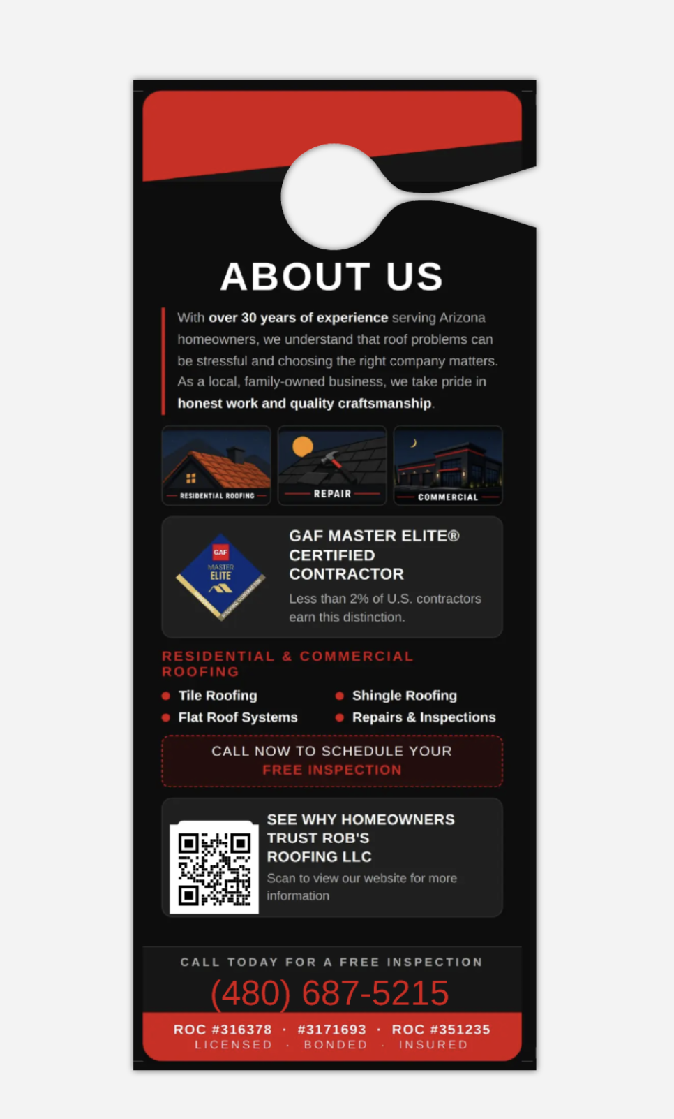
Front side sells the promise ("It's Never Just a Roof"), back side does the proof (30 years, GAF Master Elite, services, reviews QR). Designed as a real diptych: front and back have separate jobs but read as one piece.

03 · Sales Collateral
A folder that closes the meeting.
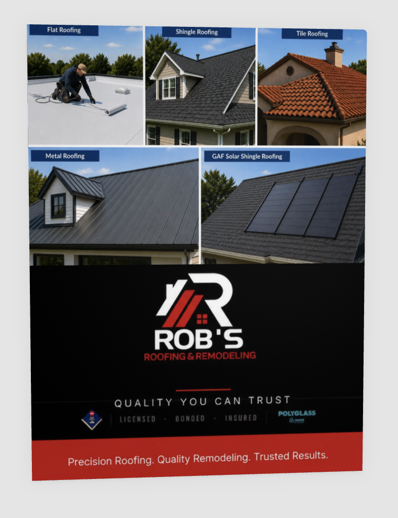
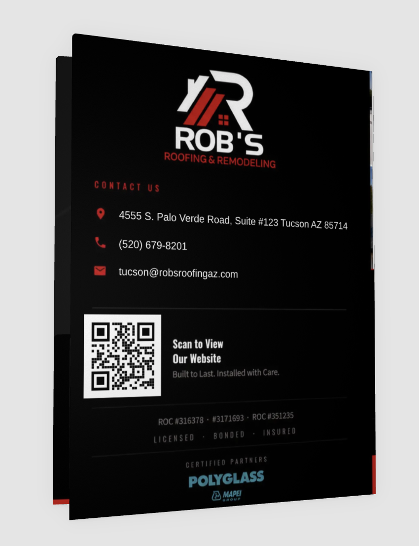
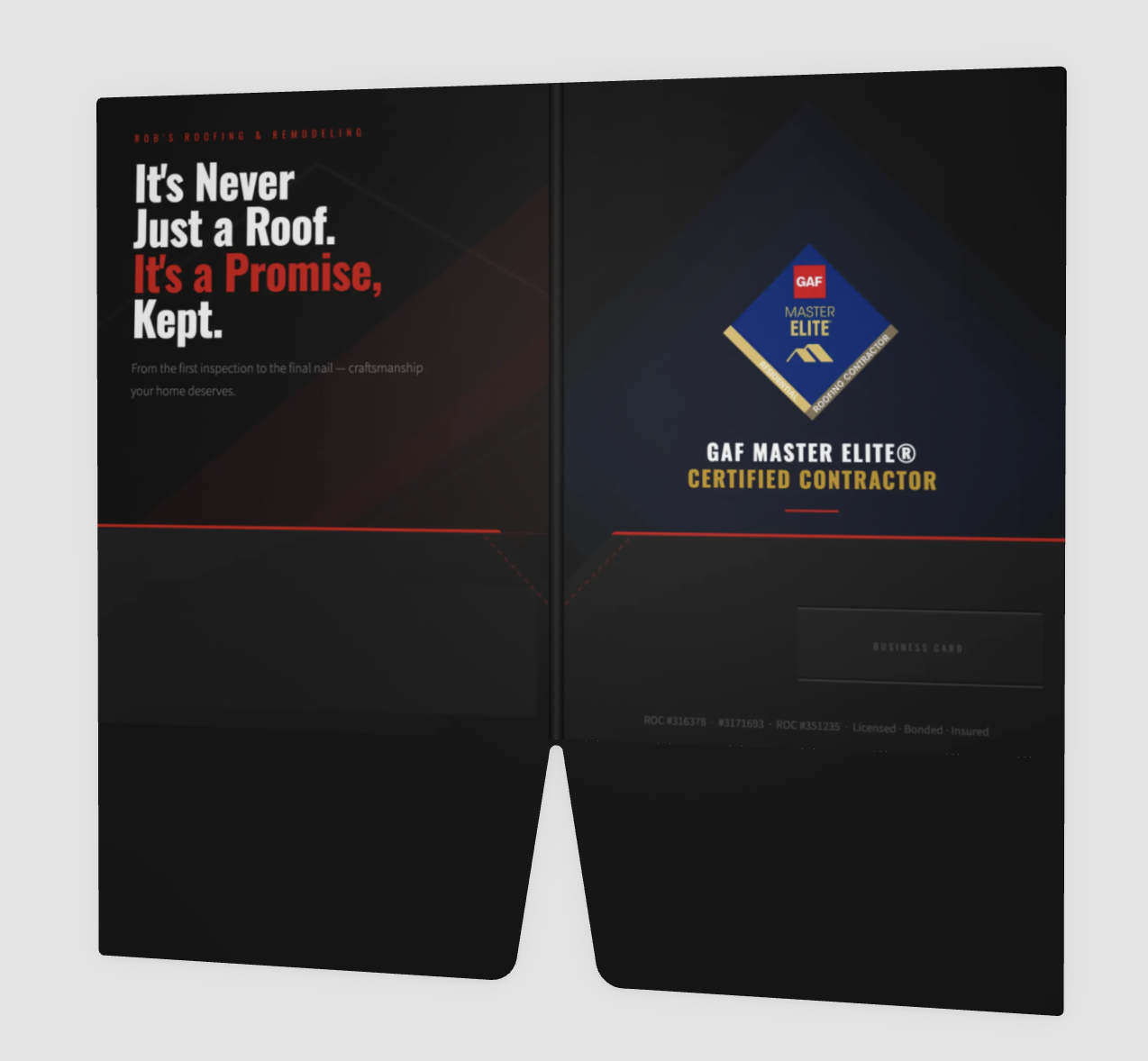
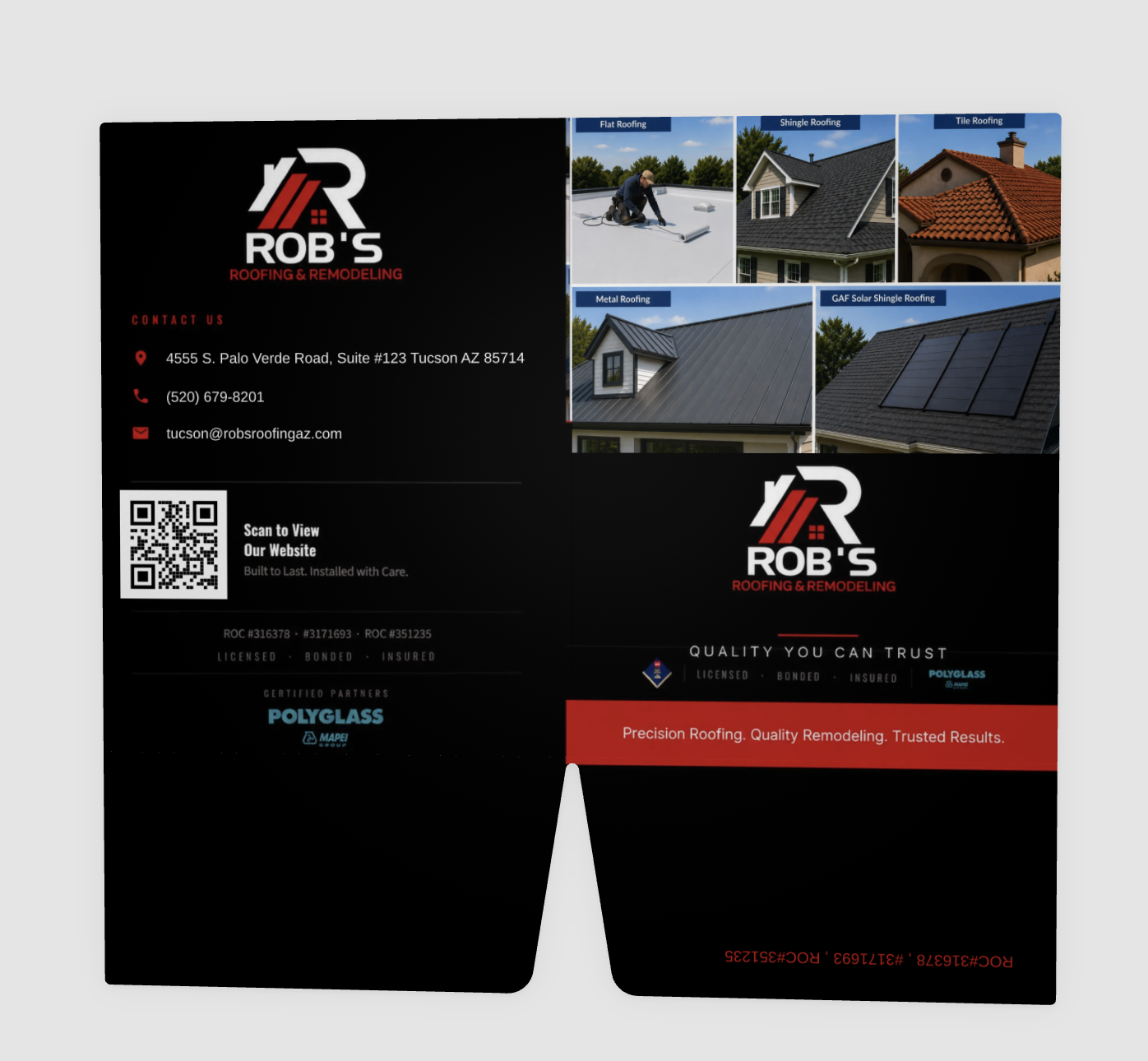
Presentation folder used in the field: front cover shows the full services range, inside spread carries the brand promise and GAF certification, back holds contact and QR, with a slot for the rep's business card. The unfolded views show how the panels work together as one object.
04 · Flyers & Mailers
One story, two pages.
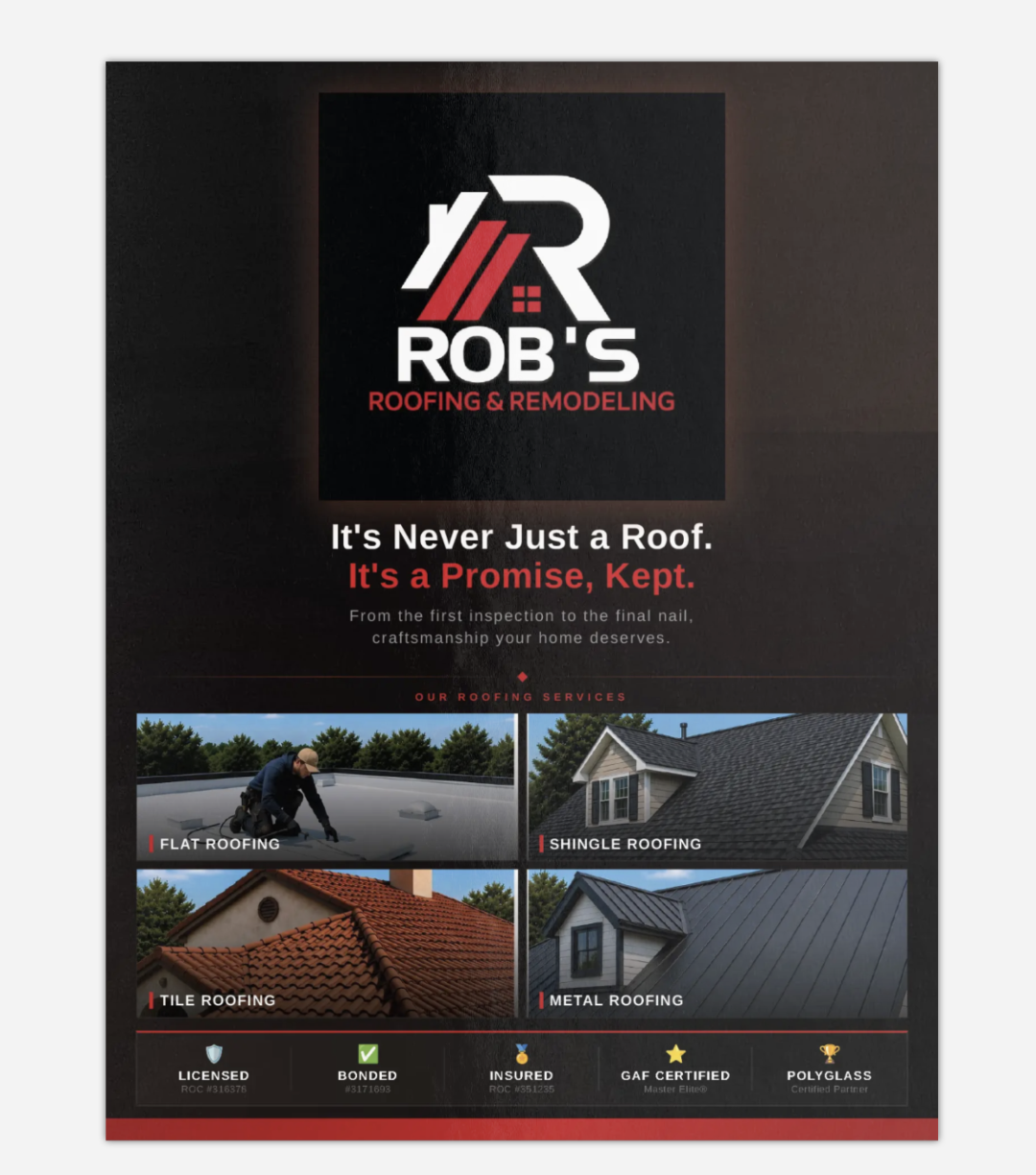
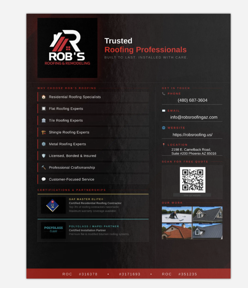
Two-sided flyer used for direct mail and drop-off. Cover carries the emotional headline and services grid, back carries the trust stack, contact block, QR, and work samples. Same visual language as the door hangers so the brand compounds across touches.





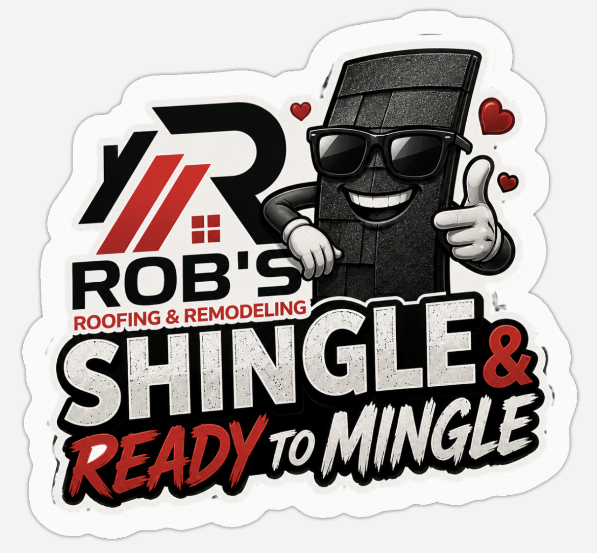
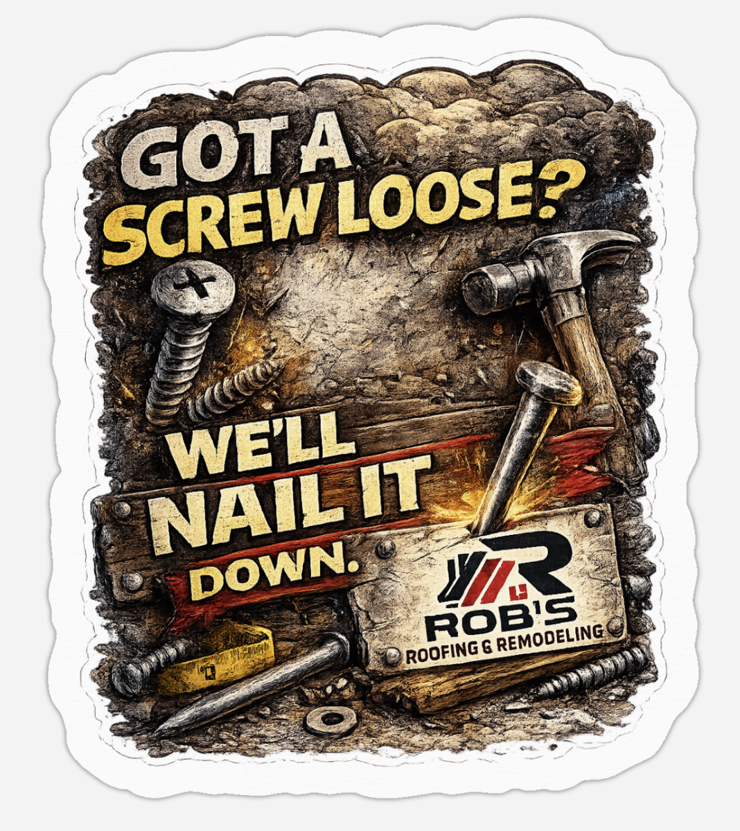
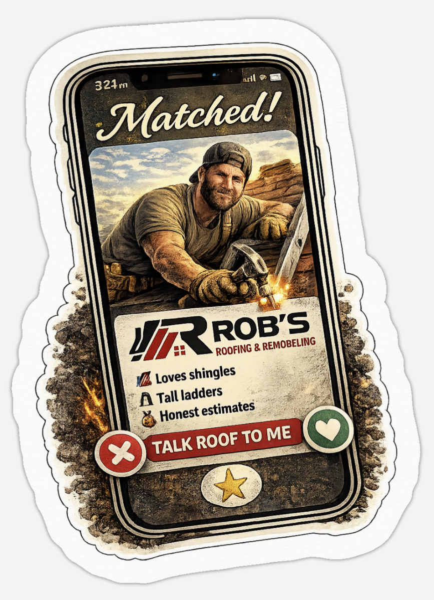
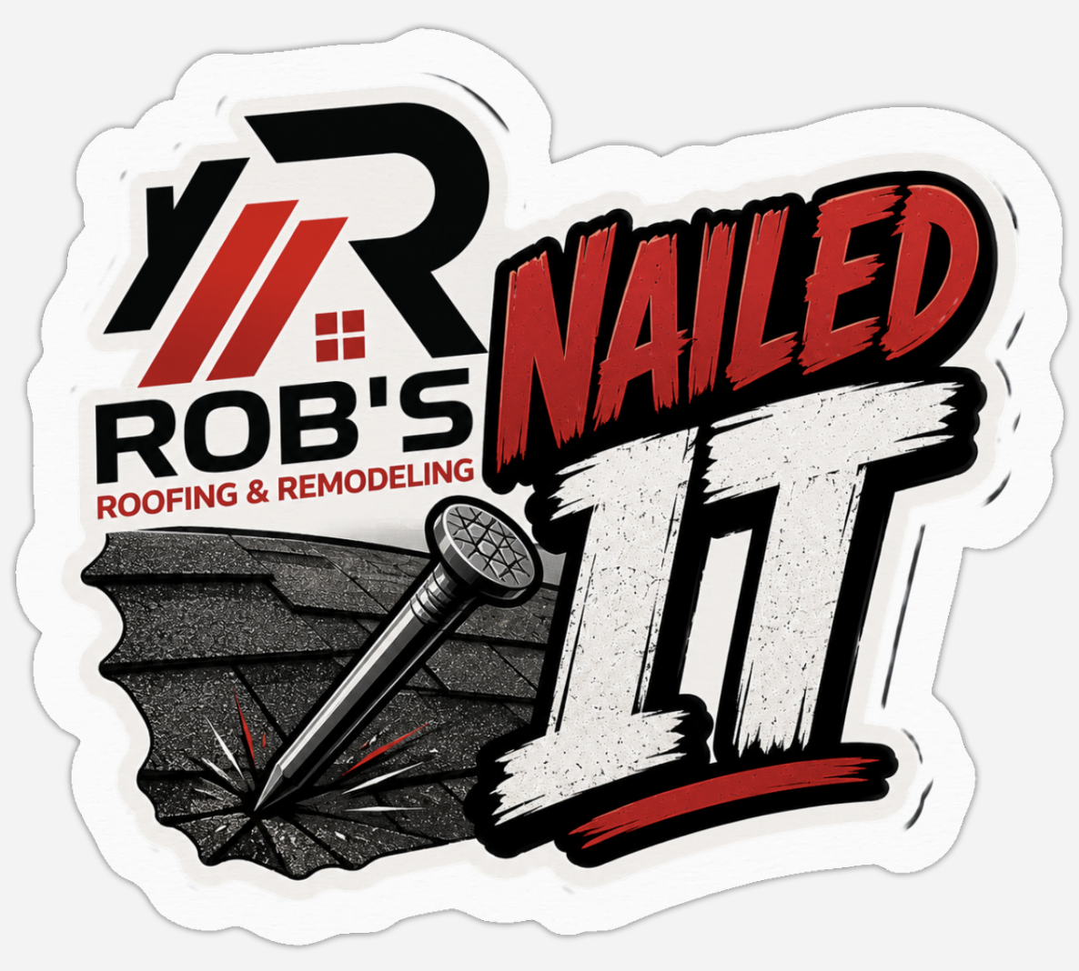
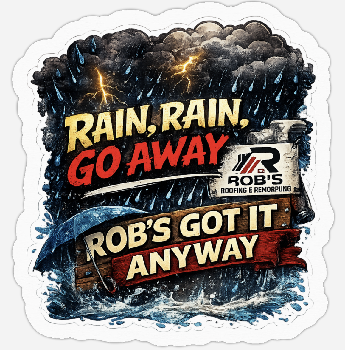
05 · Stickers
Small surfaces, big personality.
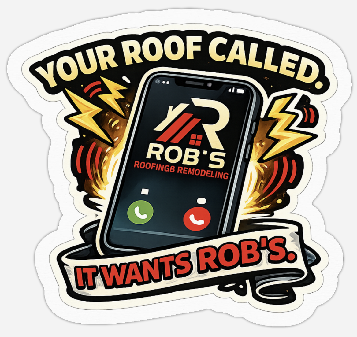
A sticker set that lets the brand travel: hard hats, laptops, water bottles, truck windows. Same voice as the rest of the system, just louder and looser, roofing puns, honest work, zero apologies.
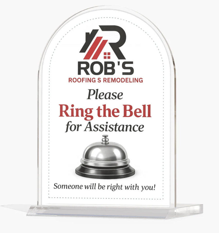
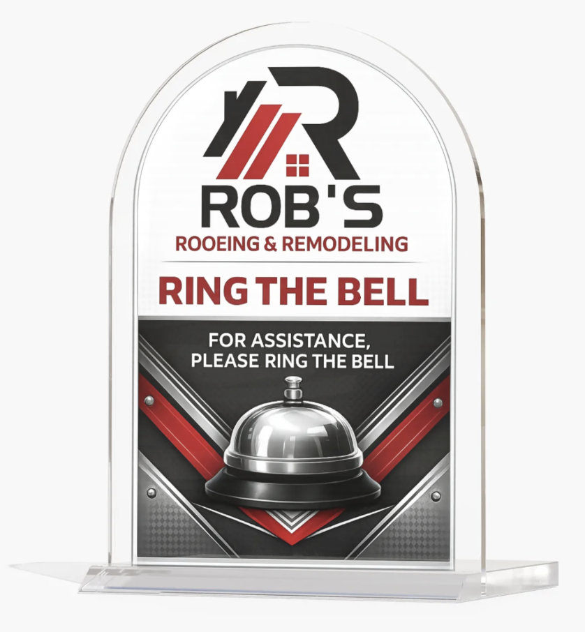
06 · In-Store Signage
Front-desk pieces that greet you first.
Acrylic table signs for the front desk and showroom. Two treatments of the same idea, one serif and quiet, one bold and direct, tested to see which reads faster from across a lobby.
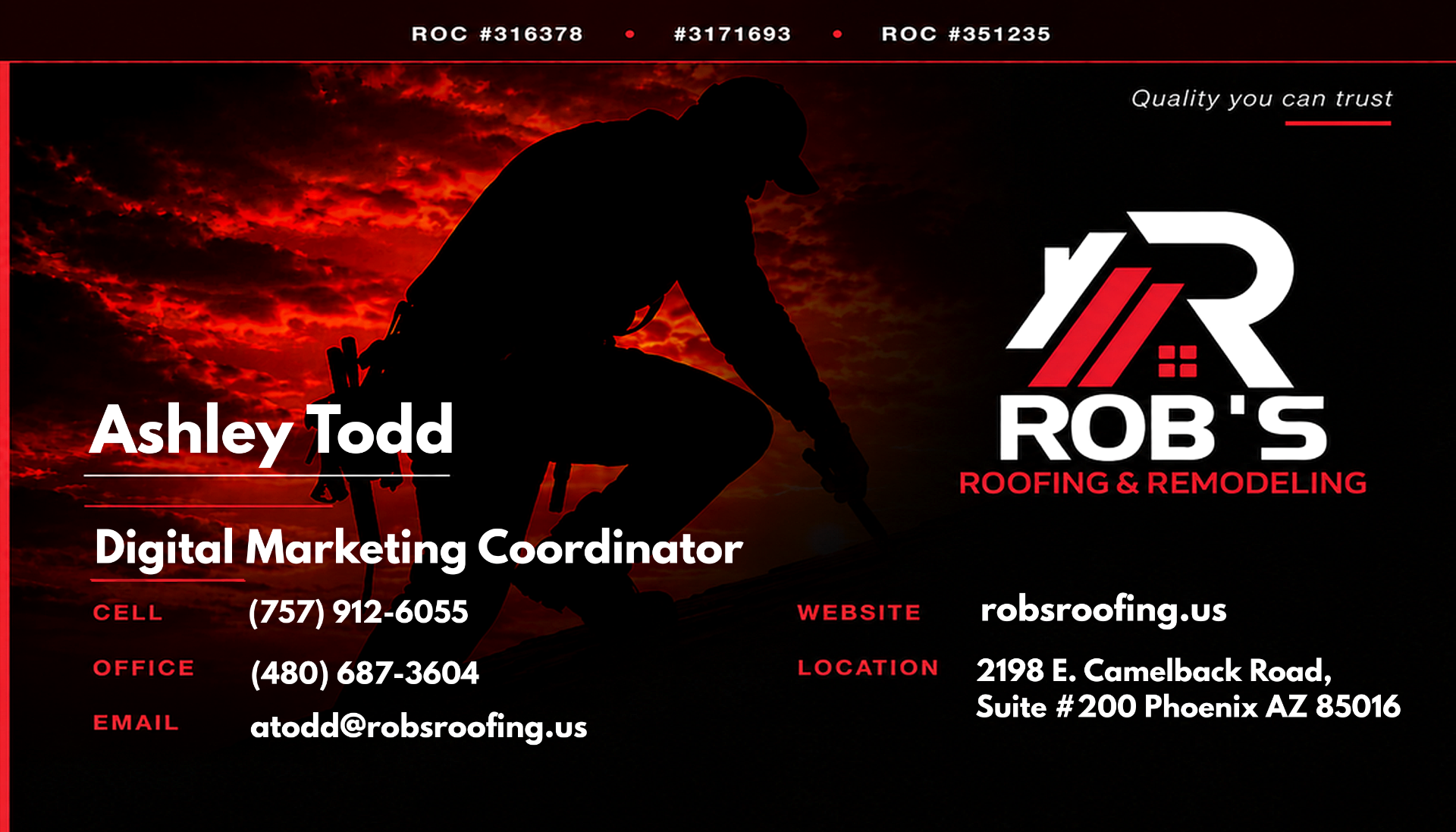
07 · Business Cards
The brand in a wallet.
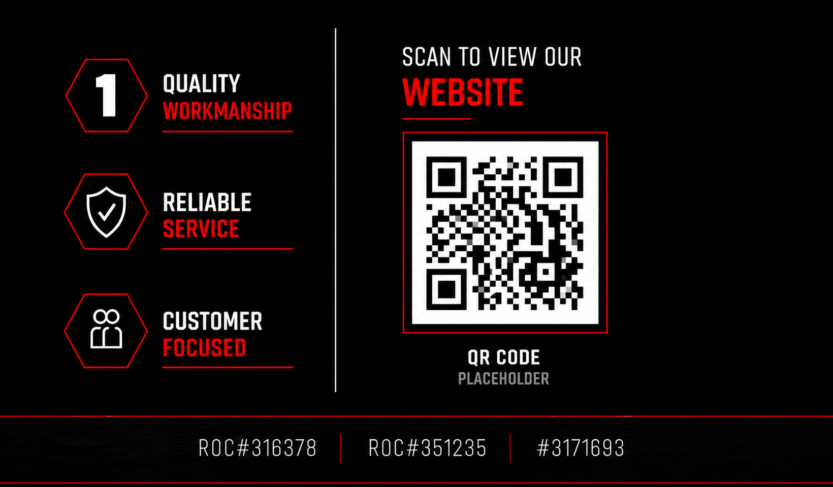
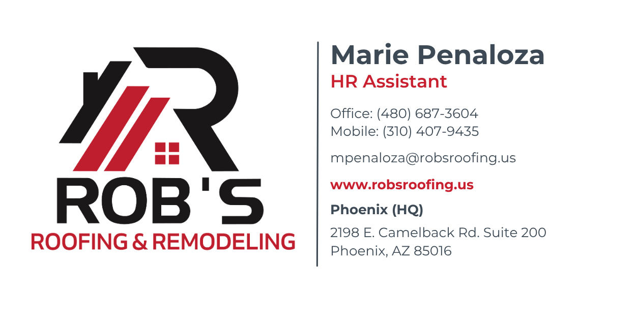
A two-sided business card system: personalized fronts for each team member, a shared back that carries the trust icons, licensing, and QR to the website. Same visual DNA as the folder and door hanger, just at pocket size.
08 · Cross-Brand Print, Mephisto Scottsdale
Same discipline, different brand.
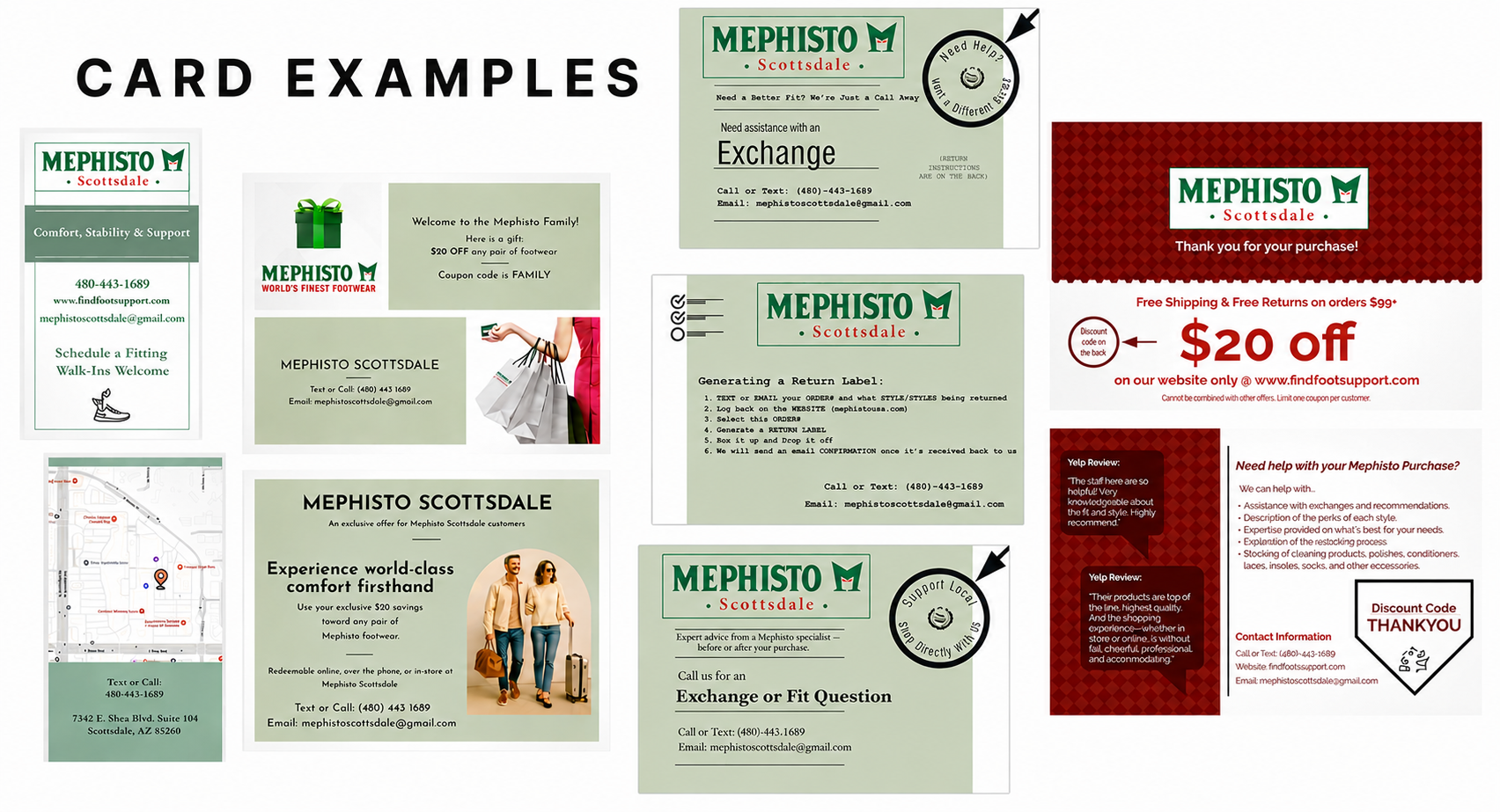
The same print system applied to a second client: a family of in-bag cards for Mephisto Scottsdale covering thank-you notes, exchange instructions, return steps, welcome gifts, and location cards. Different palette, different voice, same rule that every touchpoint has a job and does it clearly.
Next Case Study, 07 / 08